Updated Design - June 2014

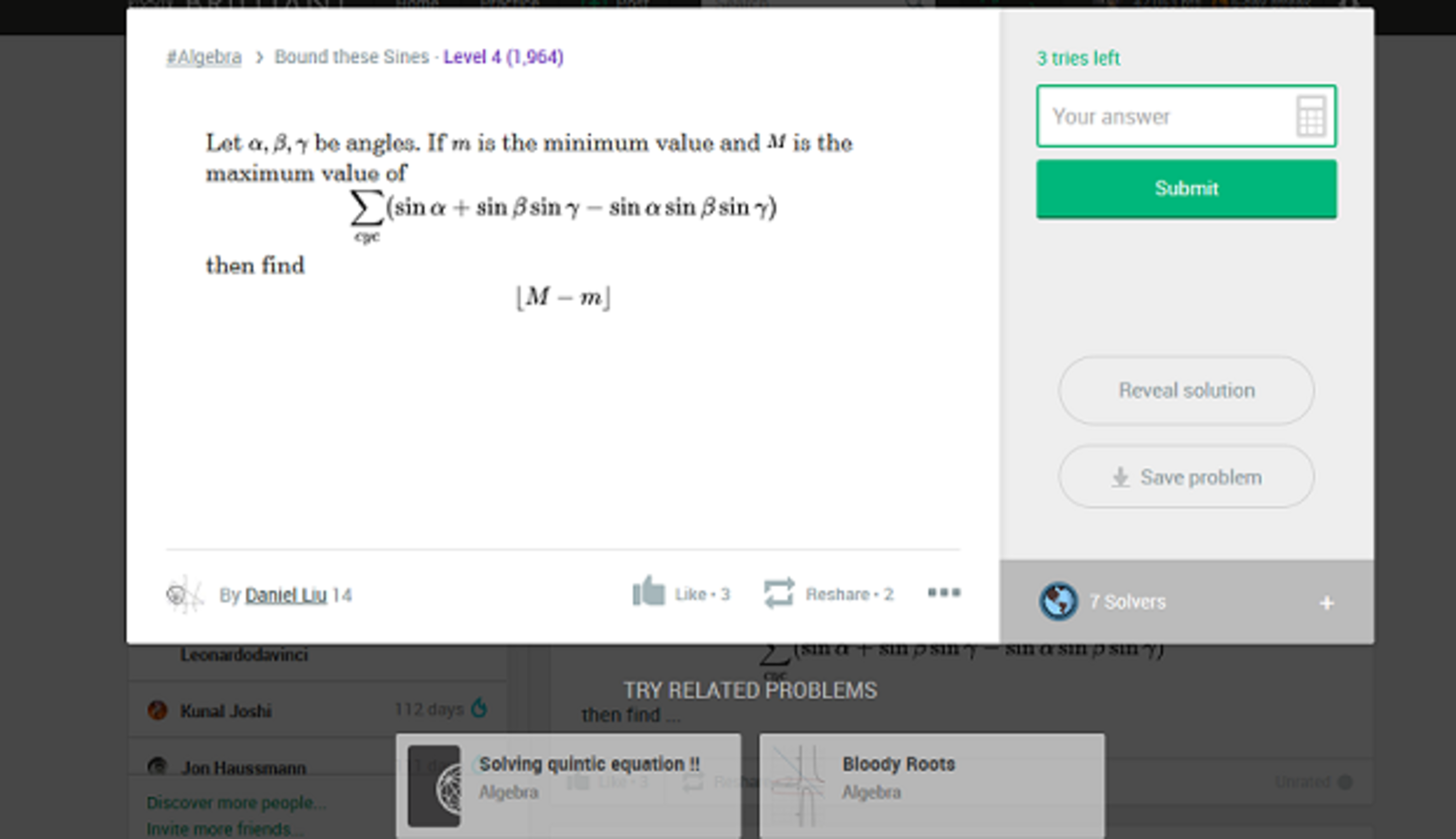
So checking Brilliant today, I saw the new design for displaying problems. It looks somewhat better than before, but I can't get over the white space underneath the problem and having the answer box at the side. It feels a little awkward for me. Opinions? It might be helpful to hear from mobile device users too.
1 vote
Easy Math Editor
This discussion board is a place to discuss our Daily Challenges and the math and science related to those challenges. Explanations are more than just a solution — they should explain the steps and thinking strategies that you used to obtain the solution. Comments should further the discussion of math and science.
When posting on Brilliant:
*italics*or_italics_**bold**or__bold__paragraph 1
paragraph 2
[example link](https://brilliant.org)> This is a quote# I indented these lines # 4 spaces, and now they show # up as a code block. print "hello world"\(...\)or\[...\]to ensure proper formatting.2 \times 32^{34}a_{i-1}\frac{2}{3}\sqrt{2}\sum_{i=1}^3\sin \theta\boxed{123}Comments
Hey Justin, thanks for the feedback! We made a side-by-side navigation for desktop in part so that you could continue to view the problem while scrolling through the solutions. It takes a little getting used to, but I hope that ergonomically, it is an improvement over the previous solution-viewing experience.
Let's move the discussion over to Daniel's post New Format For Problems, which covers general feedback.
Locking this discussion.