FOX News coverage
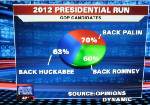
 Fox News did a survey, where potential voters were asked which candidates they backed, and they have the option to back multiple candidates. Fox News then recorded down the percentage of people that backed a candidate, and presented it in a pie chart. What is wrong with this graph?
This section requires Javascript.
You are seeing this because something didn't load right. We suggest you, (a) try
refreshing the page, (b) enabling javascript if it is disabled on your browser and,
finally, (c)
loading the
non-javascript version of this page
. We're sorry about the hassle.
The answer is because Fox news has 0 mathematicians/smart people. If sections overlap, a pi graph shouldn't be used.
In short, Fox news is stupid!