Which map?
Which map represents a realistic picture of the relative land mass area of earth, such that the various land masses have the correct sizes relative to each other?
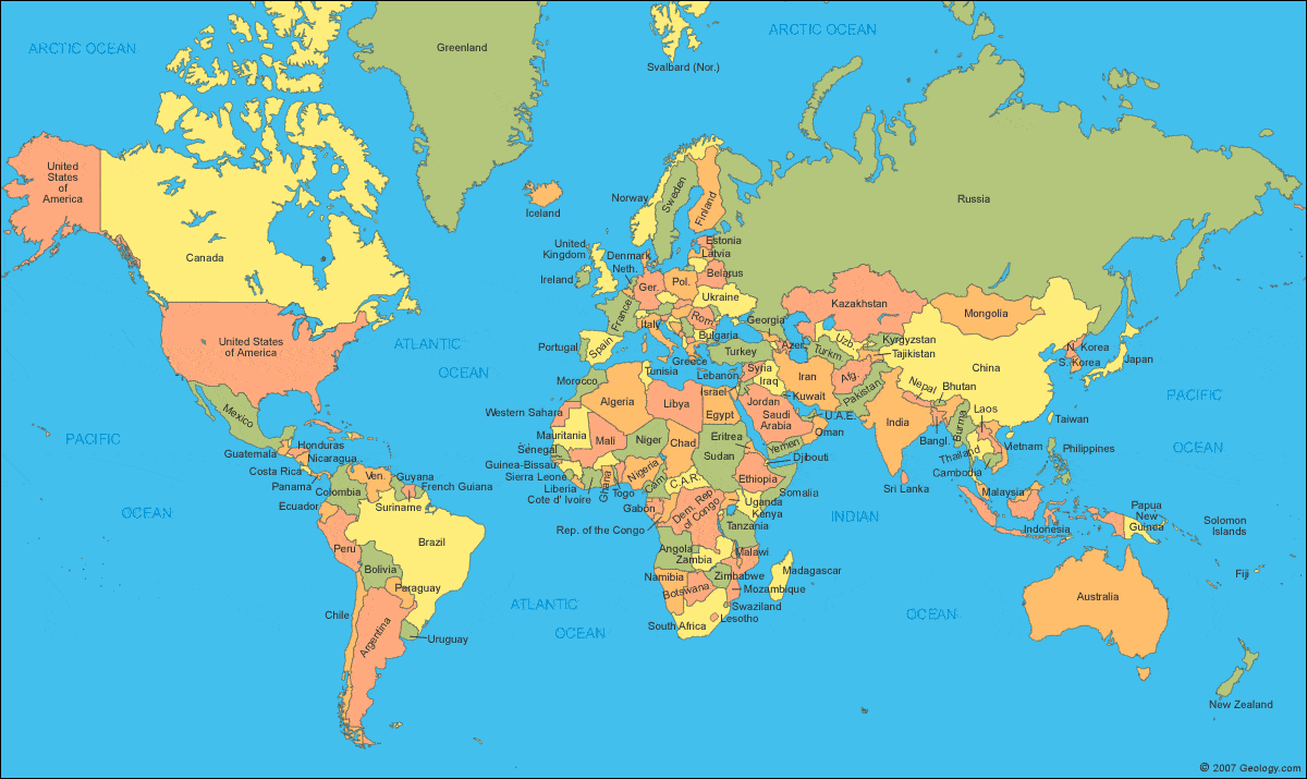
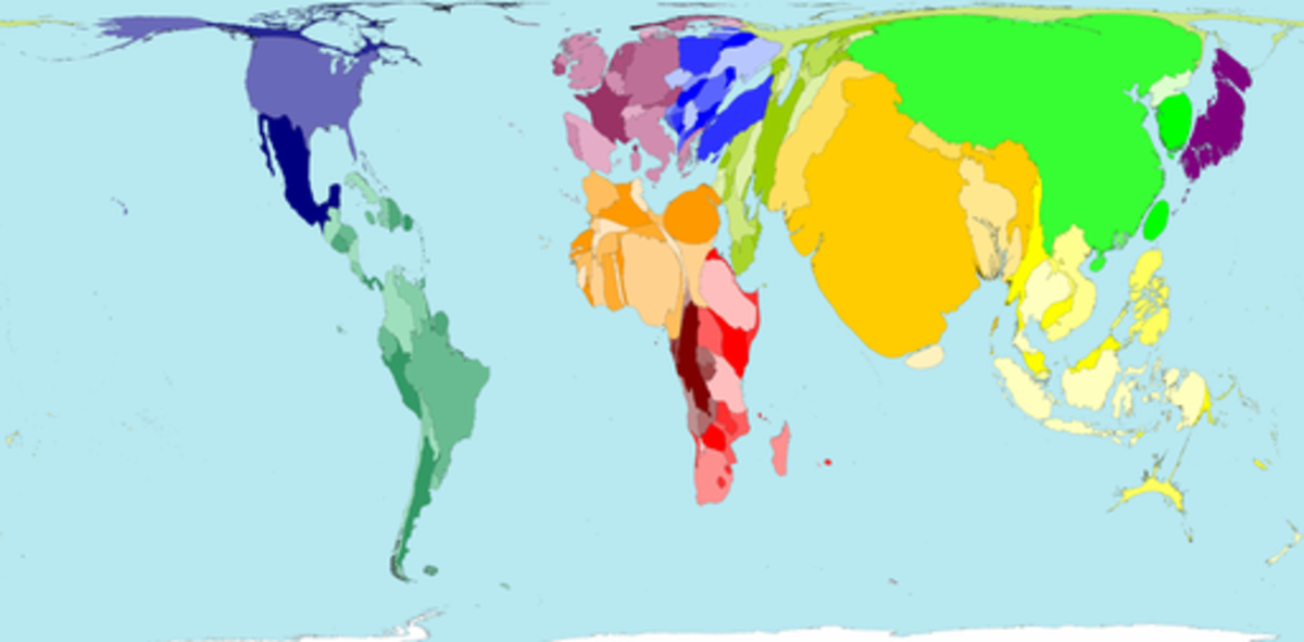
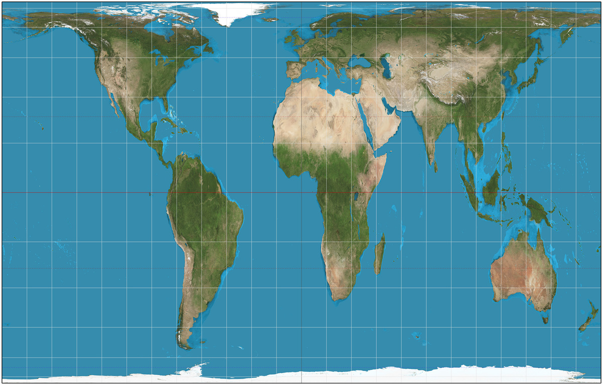
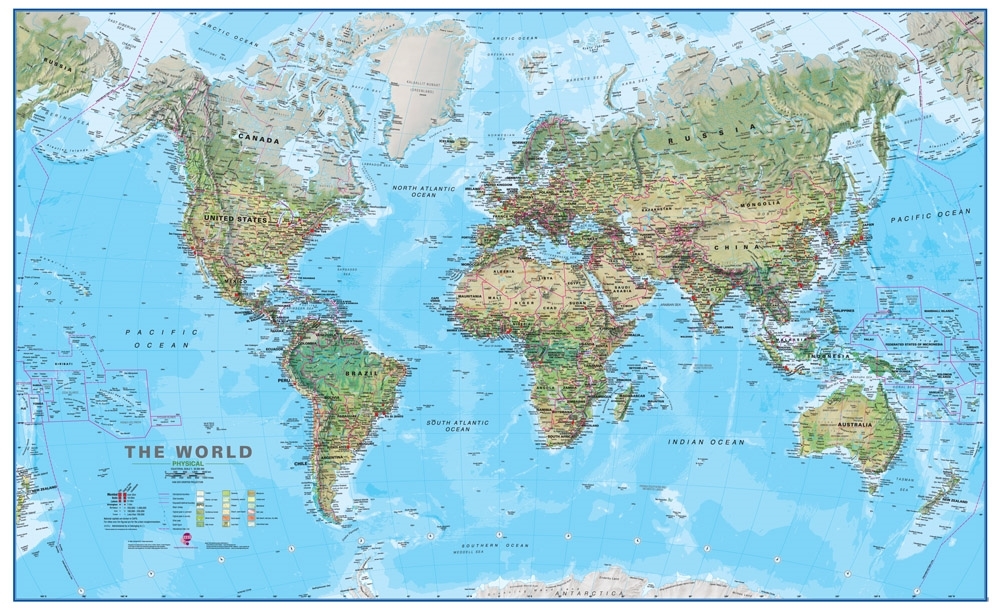
Image Credits: http://geology.com http://www.worldmapper.org https://en.wikipedia.org
This section requires Javascript.
You are seeing this because something didn't load right. We suggest you, (a) try
refreshing the page, (b) enabling javascript if it is disabled on your browser and,
finally, (c)
loading the
non-javascript version of this page
. We're sorry about the hassle.
A) and D) are maps as they are most frequently shown, but the sizes of land masses closer to the poles is exaggerated.
B) is a population map, showing what the world would look like if the sizes of land masses were proportional to the population.
C ) is called the "Gall-Peters" projection, made to give an accurate view of the relative size of all the land masses.