Spiral Art
The basic idea behind a spiral is to parametrize like this.......
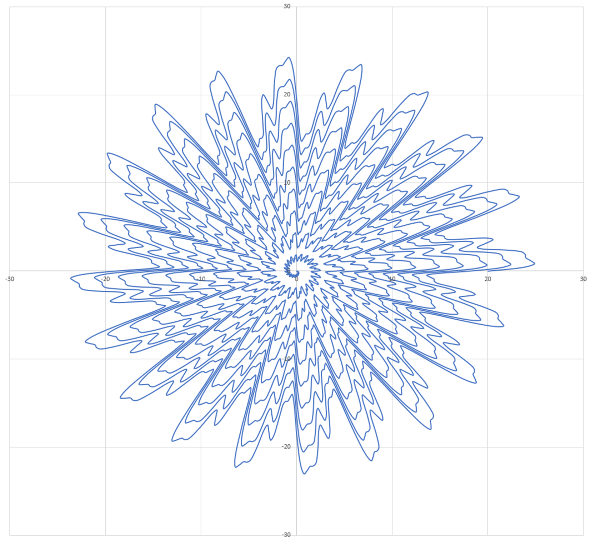
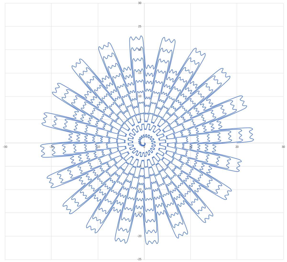
....and then gradually decrease the radius as the angle increases. To make things more interesting, you can put sinusoidal variation in the radius too, with different harmonics thrown in to create different effects. The harmonics are added so that their magnitudes are inversely proportional to their frequency, relative to the base frequency. For example, a sinusoidal term with a frequency three times that of the base term has a magnitude one third that of the base term.
I have posted two spirals: one with even harmonics and one with odd harmonics. The code to generate these is also attached. Click the images to enlarge them.
1 2 3 4 5 6 7 8 9 10 11 12 13 14 15 16 17 18 19 20 21 22 23 24 25 26 27 28 | |
Easy Math Editor
This discussion board is a place to discuss our Daily Challenges and the math and science related to those challenges. Explanations are more than just a solution — they should explain the steps and thinking strategies that you used to obtain the solution. Comments should further the discussion of math and science.
When posting on Brilliant:
*italics*or_italics_**bold**or__bold__paragraph 1
paragraph 2
[example link](https://brilliant.org)> This is a quote# I indented these lines # 4 spaces, and now they show # up as a code block. print "hello world"\(...\)or\[...\]to ensure proper formatting.2 \times 32^{34}a_{i-1}\frac{2}{3}\sqrt{2}\sum_{i=1}^3\sin \theta\boxed{123}Comments
@Neeraj Anand Badgujar Per your request
@Karan Chatrath In case you are interested
Log in to reply
@Steven Chase Sir .Thanks Yeah it's also awesome. But I like your profile images more than this. They were more crazy according to my opinion.
Log in to reply
Creating the profile pic must have been much harder, due to the wireframe and the 3d aspect of it, that too on python.
Log in to reply
Yeah, the helix was a much bigger undertaking
Yeah and the rendering time without GPU wow...
@Steven Chase when I copied this code and run in my computer and plotted in excel I get this image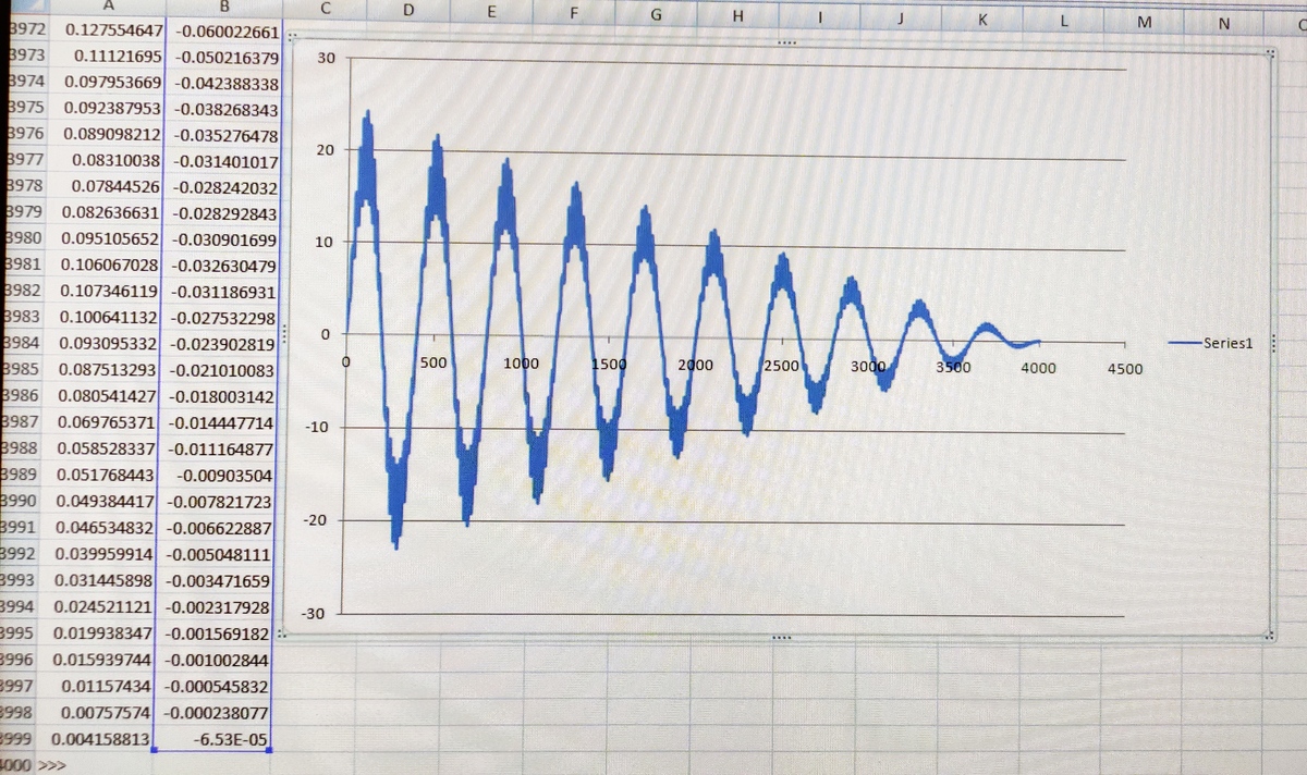
Log in to reply
Hmmm... that's interesting... what do you think the error might be?
Log in to reply
@Krishna Karthik Bro I don't know, can you run in your computer and reply me what you are getting. Thanks in advance
Log in to reply
Of course! cheers.
Log in to reply
@Krishna Karthik bro i am waiting for your comment .what are you getting while running the above code ??
thanks in advance.
Log in to reply
I get the same thing as Steven did. I think you have copied the code wrong.
Log in to reply
@Krishna Karthik ok bro let me try again. thanks
btw if you don't mind ,please call him as Steven sir .they are older than us.
Log in to reply
Bro, this is the internet. People are called informally on the internet. Unless they specifically say against that, I am going to just call them by first name.
I think it's some sort of an Indian custom to suffix with sir for someone older. Maybe I'll refer to him as sir if I directly address them.
Log in to reply
@Krishna Karthik as you wish bro.it is your choice .
He has helped me so much in physics and maths ,so its my respect for him
Log in to reply
Very true. He has pointed me to so many resources, really great person. He helped me with classical mechanics and inspired me to learn numerical technique. I do respect him a lot. I will address him as sir when I speak to him. Thanks bro, cheers! :)
Oh, I think I noticed the error and why the graph is not showing the correct thing. Have you perhaps only chosen one of the columns? Make sure you select both and look at the line, not the line with dots (as it will clutter).
Ha that's really cool! I really like python. Try to paint a Mandelbrot Set!
Log in to reply
Here you go
https://brilliant.org/discussions/thread/plotting-the-mandelbrot-set-roughly/
I think the second spiral looks the best. I really love how it spirals inward.
@Steven Chase sir the code which you have provided above.
i run this code and when plotted in excel and was not giving the figure which is above .
as obvious Thanks in advance
Log in to reply
Highlight both columns and then plot as a scatter with smooth lines
Log in to reply
precicely, sir. That's what I think the error is too. Scattering with dots will create clutter too.
Yup, buddy, I think you haven't underlined both columns. Plot with smooth lines too.
@Steven Chase sir i have highlighted both columns many times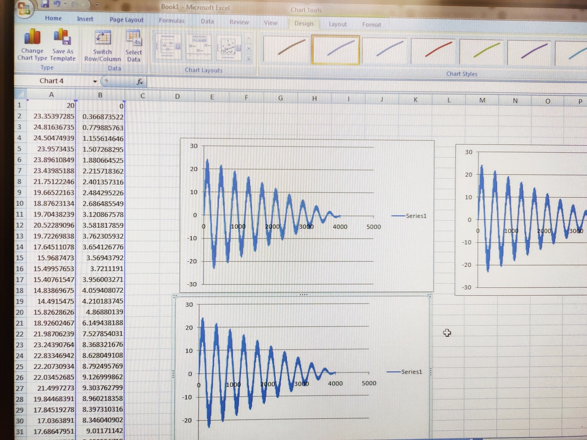
I am getting this only
Log in to reply
Nope, it still only shows one column.
put a variable (x) on the x column, y on the y column ABOVE the columns; click on x, hold, and drag it all the way down to the end and click on the smooth line chart.
You should have names above each column. The column on the left will automatically be identified as the independent variable, and the right the dependent.
Click on the left column's name and drag it down, highlighting both columns.
Log in to reply
@Krishna Karthik thanks sir but why image above is more clear than my pC image
Log in to reply
You can re-size the plot and make the lines thinner
Log in to reply
Ah, I was having the same problem too with thick lines. Thanks sir!
@Steven Chase sir which option should i choose to make it thin
Hey, do you use Windows 7 or 10?
Log in to reply
@Krishna Karthik 7
Log in to reply
Yeah, I thought so. Is that a Dell laptop?
You should upgrade it. I kinda miss Windows 7 though lol now that I upgraded my PC... =..(
Log in to reply
@Krishna Karthik windows 10 have more features than 7?
if yes how can i upgrade
Log in to reply
Windows 7 is really outdated now; but Windows 10 is expensive. It's not extremely worth it or anything, but next time you get a PC you will automatically have Windows 10 with it =)
@Steven Chase yeah now it is coming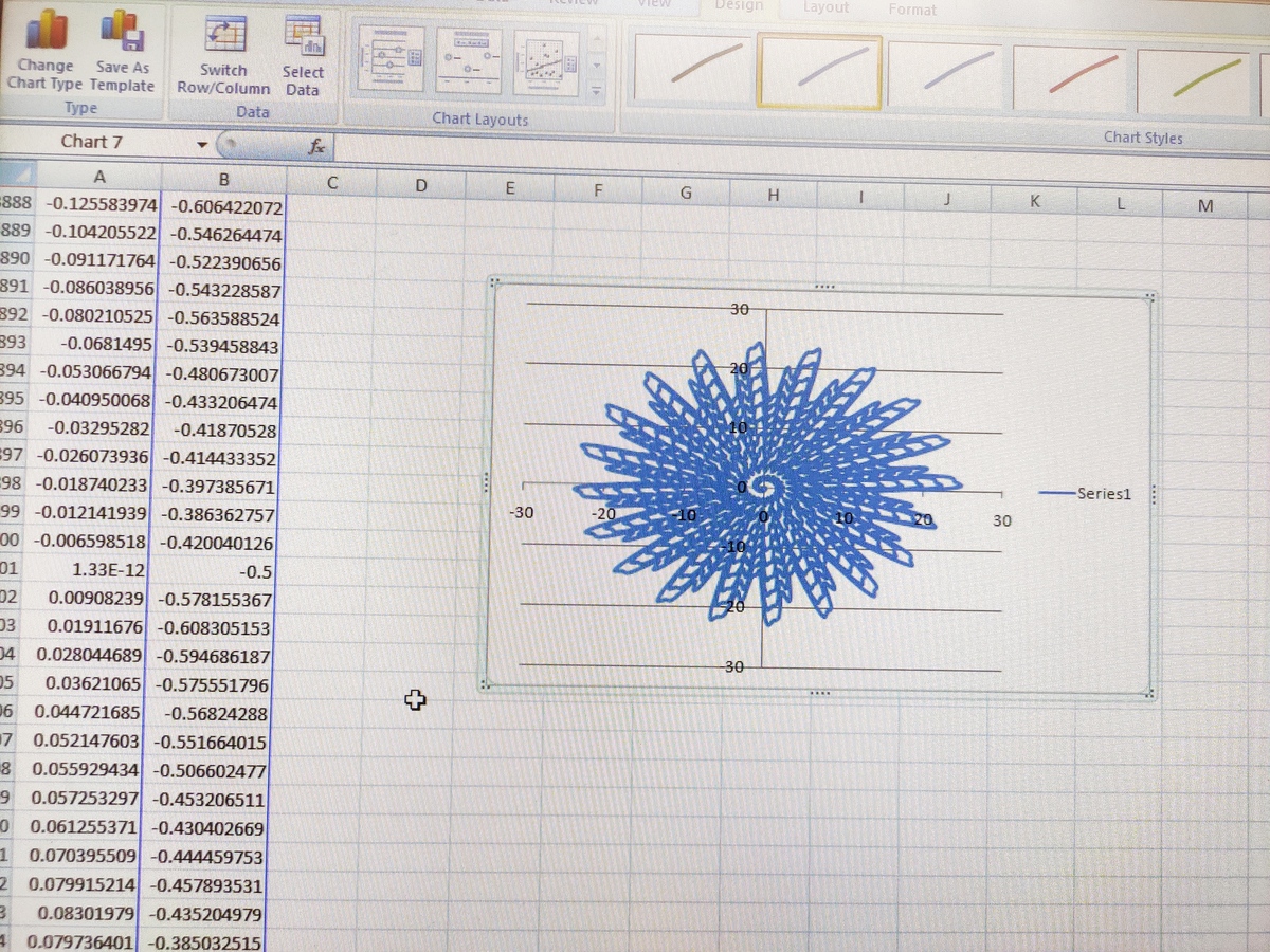
Log in to reply
Perfect! Good stuff mate.
Yeah, the reason we are seeing the visible damping in x and y is because of the spiral.
@Steven Chase sir how do you export that image ???
Log in to reply
Hit the print screen button and then paste it into MS Paint. Then you can crop out the stuff you don't want
Log in to reply
Ah, that is much better than taking a cropped screenshot. It gets so low res for me when I take a cropped screenshot. Thanks for suggesting me the better alternative. Will use MS paint.
Yeah, that's what I was wondering as well. I just take screenshots.
@Krishna Karthik taking screenshot loses the quality if image
Log in to reply
You can put it onto MS Paint and crop out the rubbish. That's a better way. No losing of res.